CLIENT:
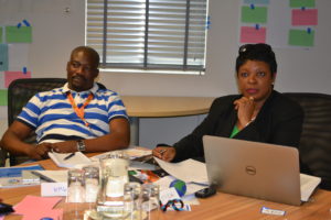
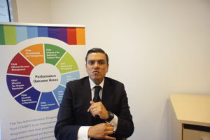
Funded by the IMF and other donor partners, TADAT was established in 2013 a public good that assesses the health of a tax administration. The TADAT Secretariat has completed over 60 assessments and trained thousands in the TADAT methodology around the world.
They had planned a major international conference to showcase their accomplishments, they were searching for innovative ways to reflect the TADAT experience globally.
APPROACH
Utilizing my background in policy and research about the TADAT experience, I formulated that TADAT needed to appeal to 4 main personas: donor partners, tax officials, academics, and the general public. Working with the Secretariat, we came up with different ways to engage each audience type through their various platforms.
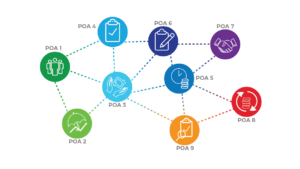
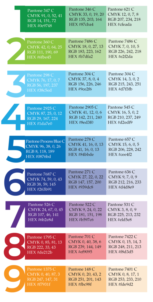
While TADAT had established a logo based on 9 color-coded areas it assesses, they had not implemented a visual identity guide to facilitate consistent communications across their various platforms and materials reflecting their values of openness and transparency.
To promote consistency, I created two less saturated hues for each area additionally giving the Secretariat a variety of options when creating reports, graphics, and other communications.
Deliverables:
A visual guide for the Secretariat including colors, typography, and table rules and select templates.
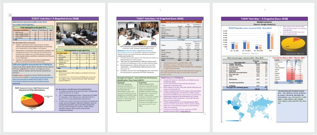
Before
Reports lacked a clear, concise style and did not utilize consistent branding throughout. Layouts seemed clunky and dated, not reflecting the modern brand.
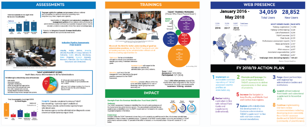
After
Layouts made use of visual cues to establish hierarchy leading to a better experience for readers. Data visualizations were created to break-up areas of text and add interest, allowing the content to shine. The visual identity was applied consistently throughout the report.
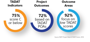
TADAT had a robust data system but did not employ innovative data visualizations.
STRATEGY: Create clean modern data visualizations that resonate openness, and transparency. Data visualizations should spark conversations among viewers about the data.
Deliverables:
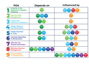
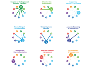
Designed innovative ways to show data trends for annual reports, conferences, and missions
Created Tableau Dashboards
Established better data collecting procedures for databases and designed tables reflecting visual guidelines
Samples
Before

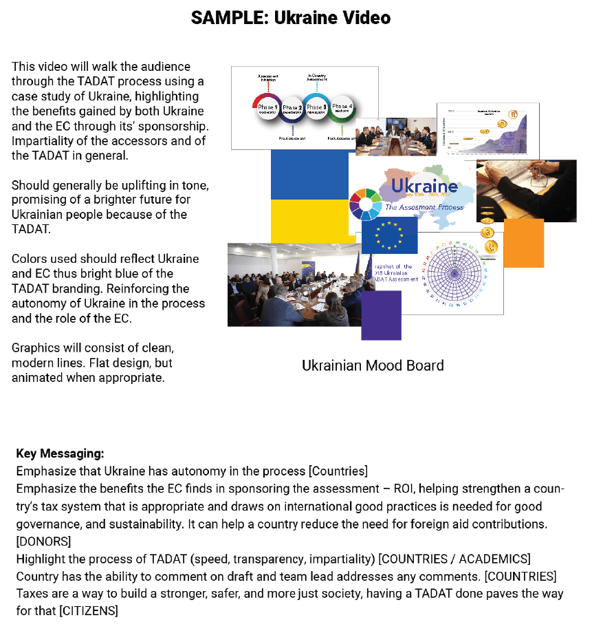
The Secretariat wanted 6 videos showcasing the TADAT experience around the globe. We worked closely together with partner countries to establish the tone, story, and production of each video.
Strategy: To give a 360 view of the TADAT experience (a full assessment, an internal self-assessment, the reforms created after, etc.).
Process: After creating a strategy and a storyboard for each video, we sent questions and strategy documents to countries for self-filming of interviews. Then using responses, I edited the interviews to create a story for each video and added motion graphics. For some videos, we interviewed officials locally to create additional footage.
Storyboard Sample

Strategy Document
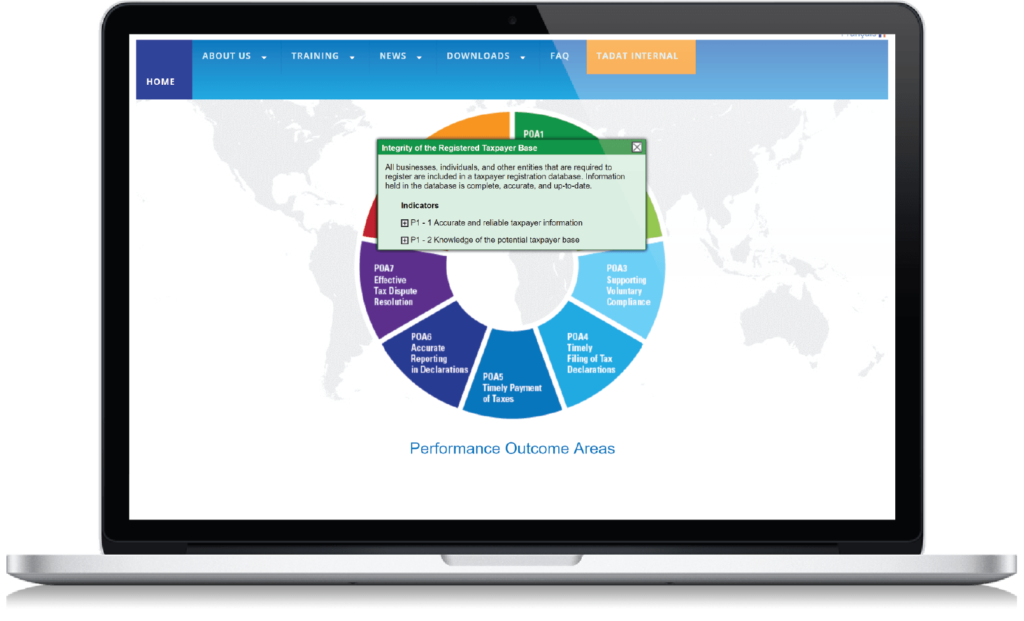
The Secretariat wanted to create a more user-friendly experience for their website.
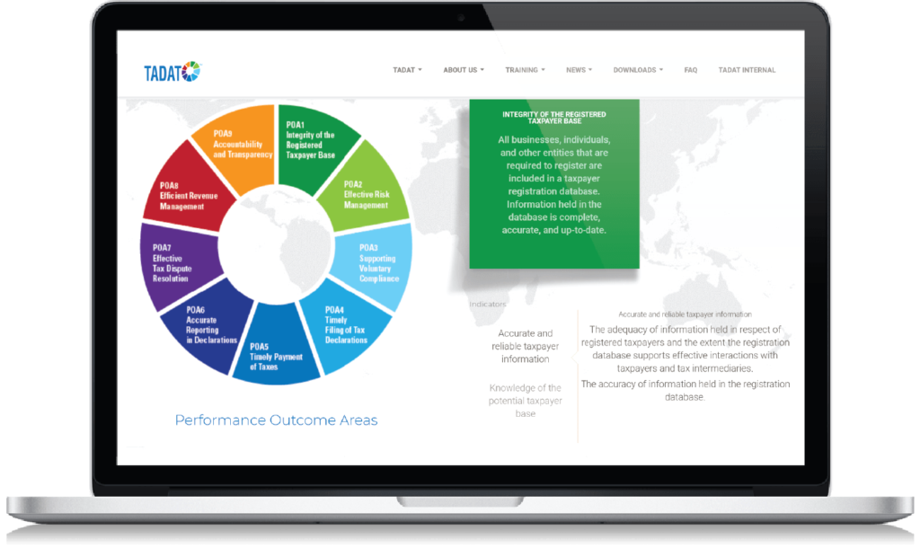
Strategy: Using data from their google analytics and interviewing staff, I established pain points the current website has. Based off of staff interviews, I noticed that the staff received numerous emails about the training options TADAT offered. Through a workshop, we realized that TADAT offered 1 type of training with 4 certifications based on applicant’s experience, whereas previously it was thought that they offered 4 types of trainings. Using feedback like this and more, I created a new layout to address those needs and applied the visual identity throughout. I also edited content to make it more web-friendly and clearer.
Deliverables:
Strategy document for developers including wireframes, guidelines, and content.
Before
After
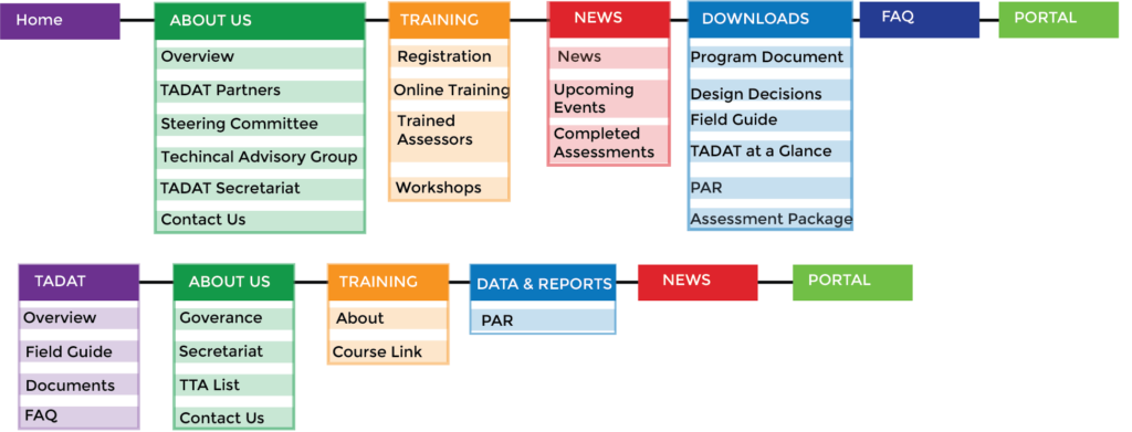
BEFORE – Old navigation menu that had too many options and confusing titles
AFTER – New layout has fewer options, better titles (e.g. About Us section is consolidated as the top for items could be shown on one page ‘Governance’ )
